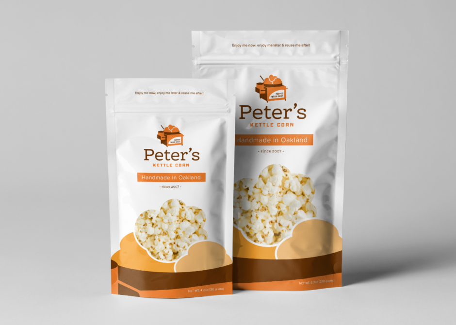
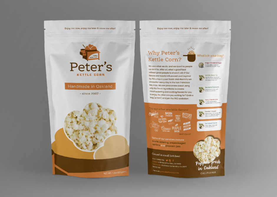
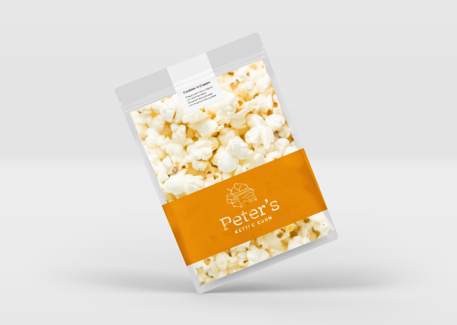
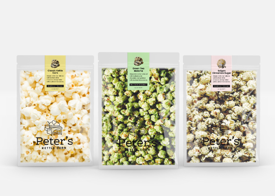
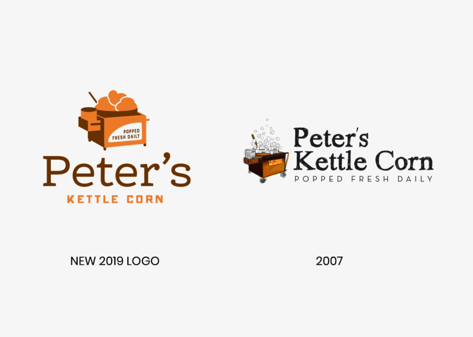
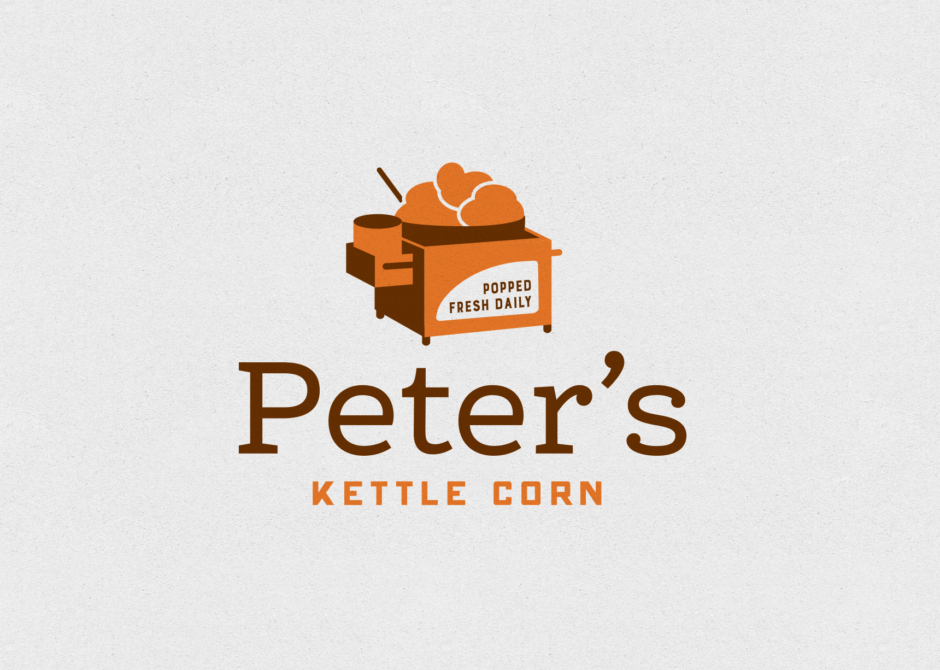
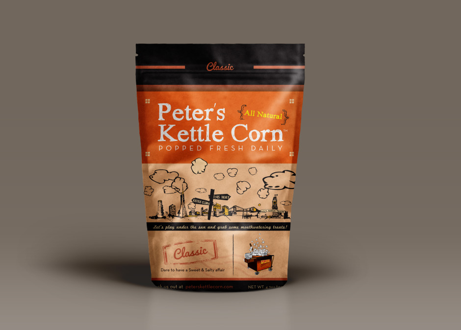
Presenting the latest designs for Peter’s Kettle Corn. The original logo was created in 2007, with gradients and detailed illustrations which have since become outdated. Therefore, we opted for a flat and minimalist approach that appeals to a wider audience while maintaining brand recognition. The logo features two colors, burnt orange and warm brown, which complement all the flavors of PKC.
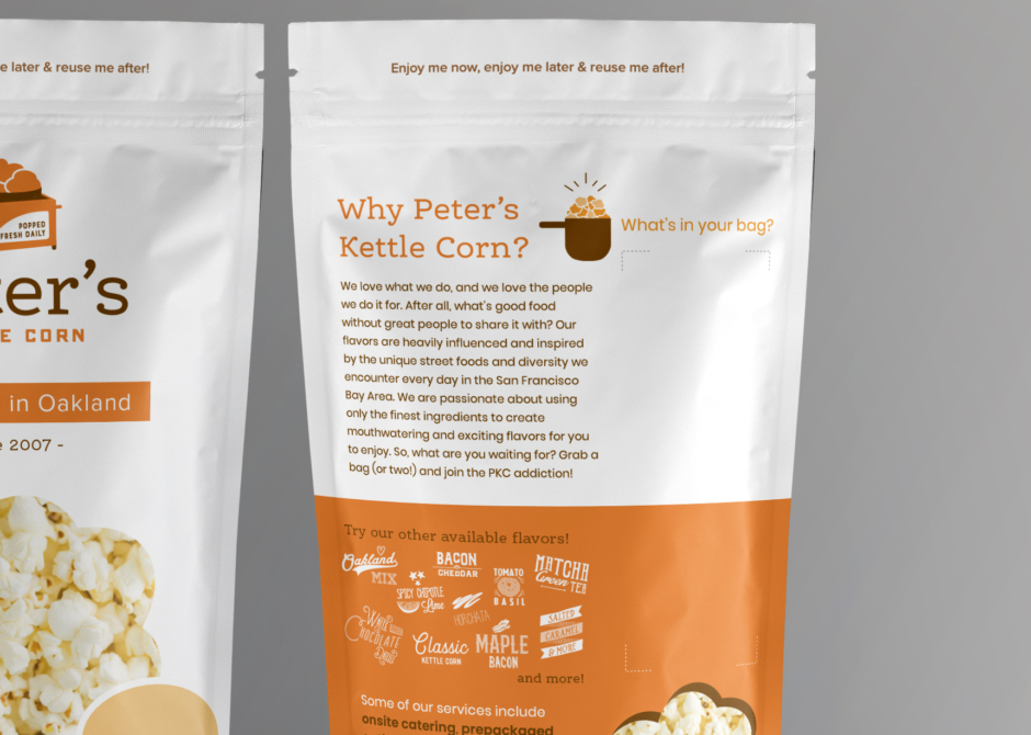
To accommodate PKC’s 30 different flavors, we had to devise a solution that would work for all without exceeding budget constraints. We decided to use 3×1 stickers, allowing space for up to (6) labels on the backside of the bag. This approach not only accommodated their customers’ preference for mixing up to 6 flavors per bag but also proved to be a design challenge that we successfully overcame.
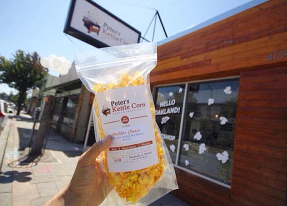
With the design process now complete, we eagerly await the final product’s print. I’m confident that the outcome will be both functional and aesthetically pleasing, perfectly representing the PKC brand.
Design Objectives:
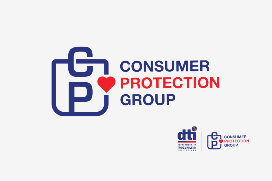
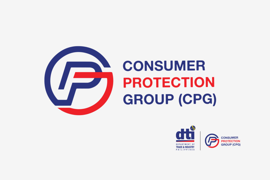
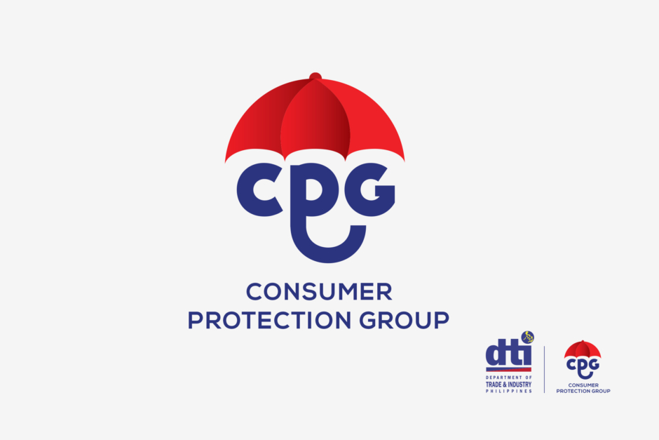
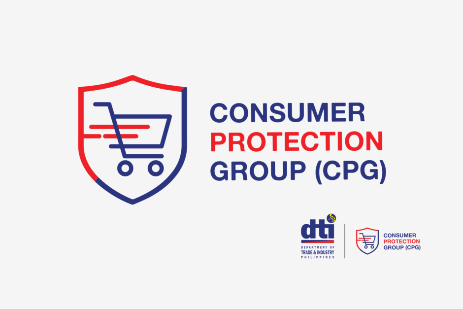
Create a logo for Consumer Protection Group that incorporates the DTI logo
Create a visual that conveys consumer protection like a shield or similar icons
Break out from the mold of a “tired” and dated government organization
Easily applicable to all collaterals and communications
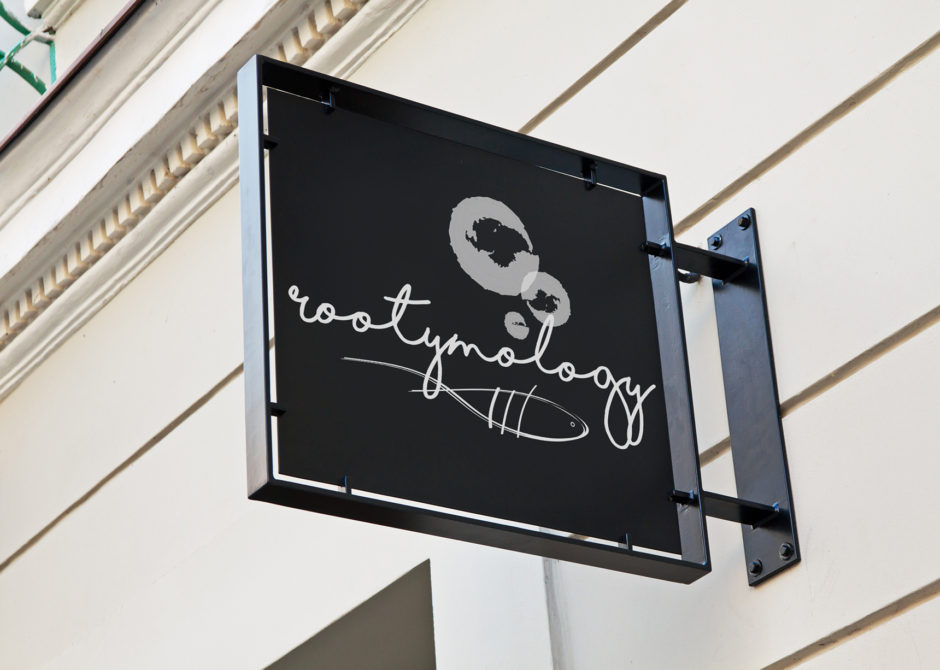
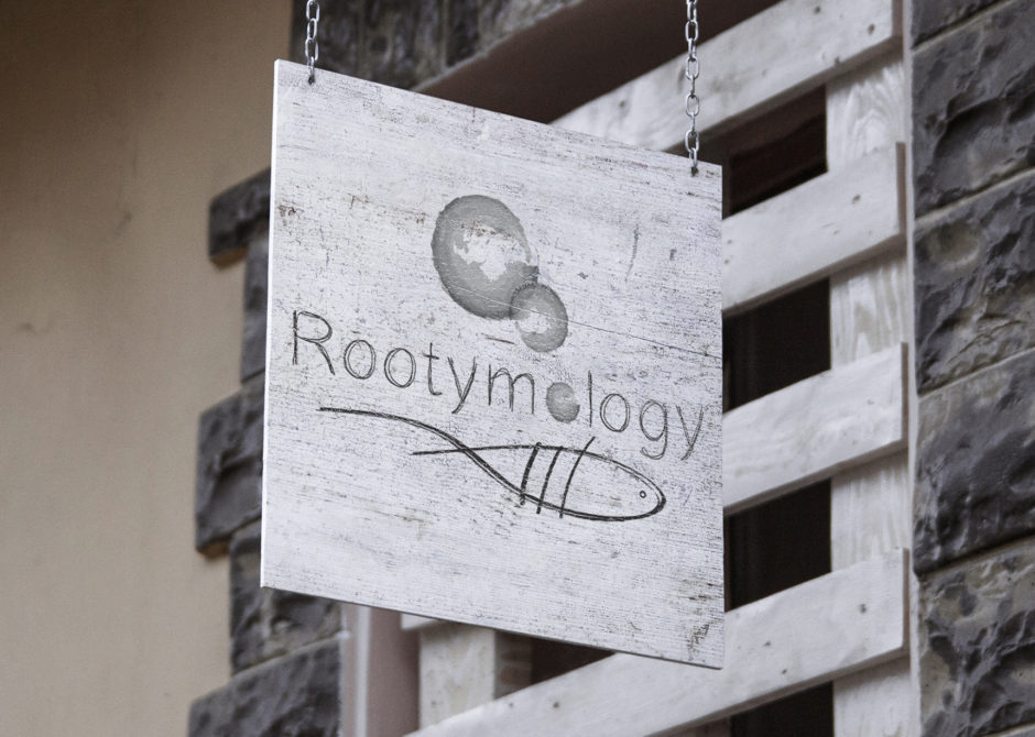
I designed this logo for what might be the name of the aquaponic business. The longer I stare at it, the more I like the one on the black sign.
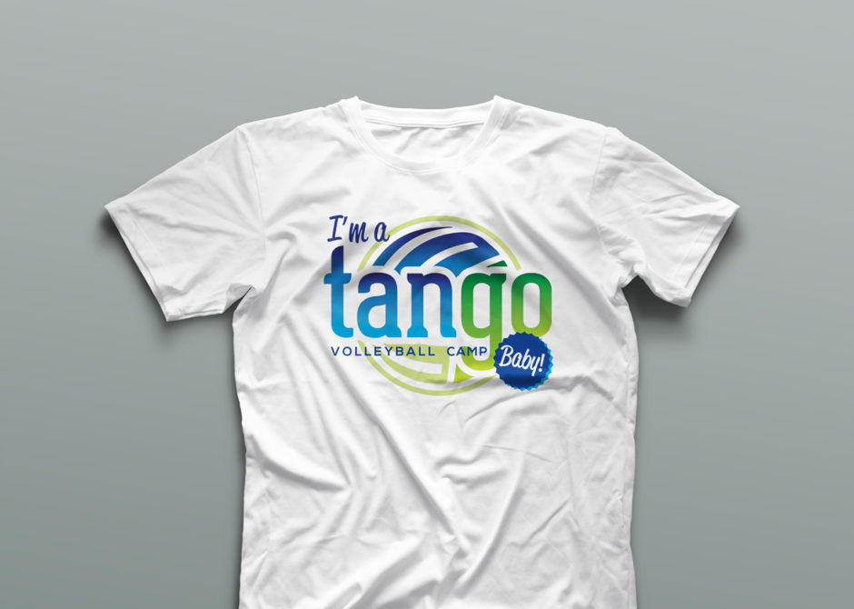
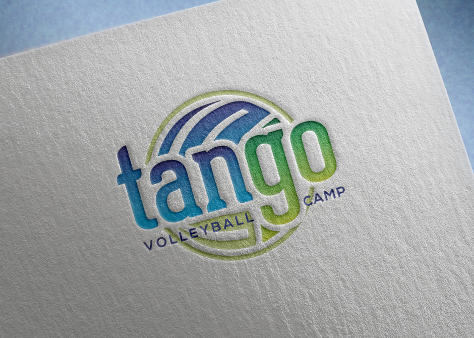
I helped a couple of old college volleyball teammates design their logo. Tan and Go are both their last names so we wanted to work those into the concept. Go U.P.!!!
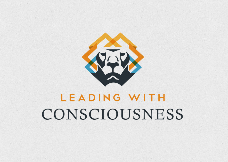
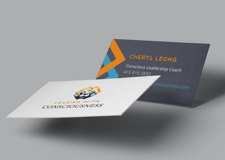
Happy to help a good friend start her conscious leadership coaching business. I asked for toners this time for my brand new color hp laser jet pro M451nw printer. Just in time for my wedding favors!
Here’s another barter project. Logo for a nice clean headshot and a bottle of whiskey.
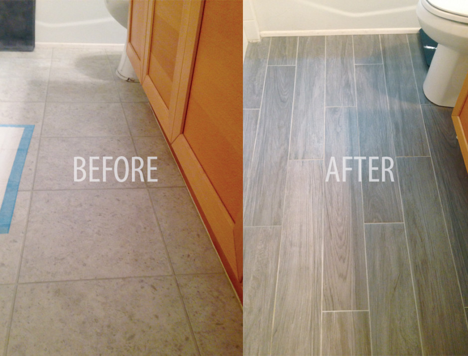
After moving into our new apartment, we decided that we wanted new bathroom tiles. We originally had laminate tiles and thanks to Diego and Fidel (our chihuahuas), they now have permanent pee stains. Where do I find a reliable contractor who’s not going to end up ripping me off???
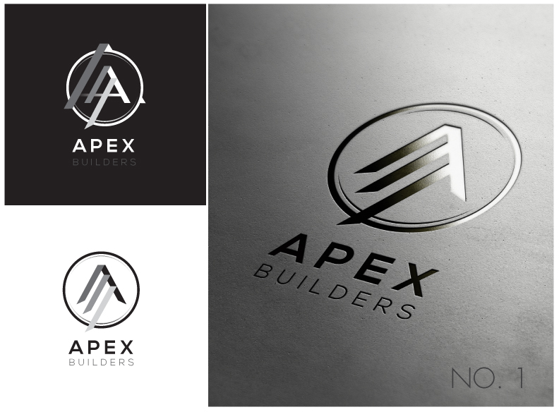
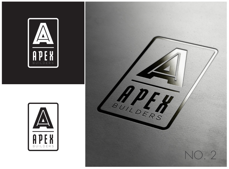
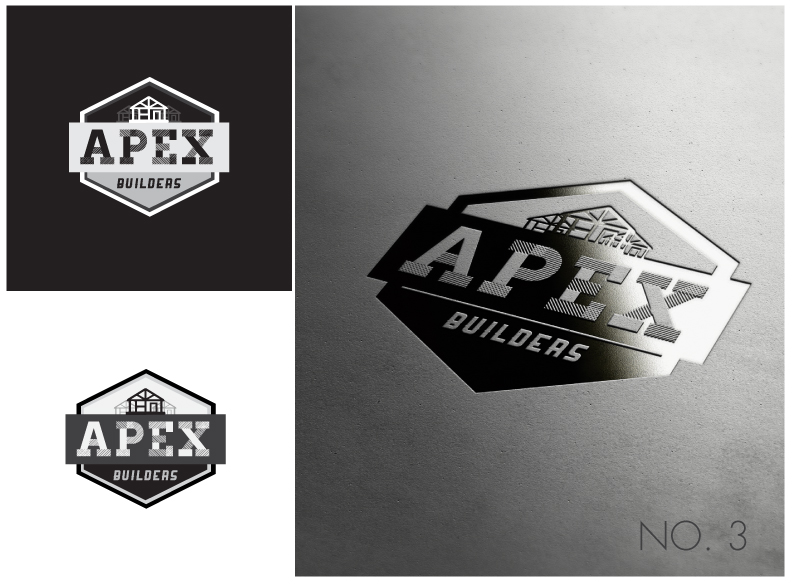
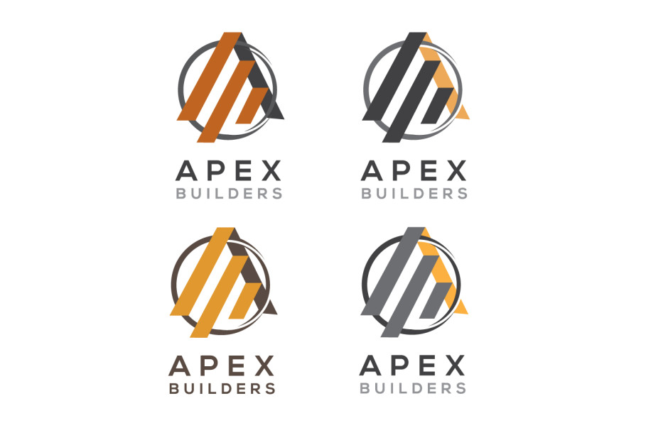
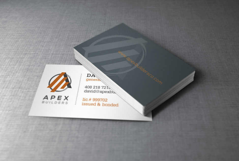
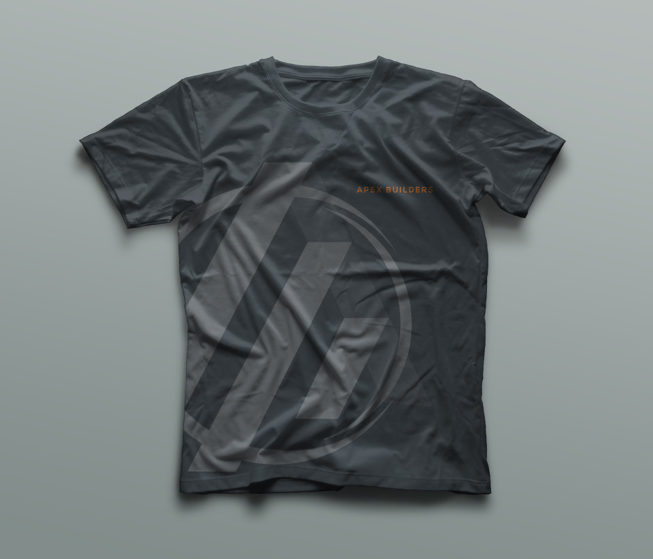
Thanks to a good friend of mine, I met David from Apex Builders. He was willing to do a trade. A logo and a website for new bathroom tiles. Done deal.
We went through several concepts and we finally zeroed in on the first concept. Cleaned it up, added some colors… and voila – Apex Builders’s new brand.
Did I mention that we also got a new toilet installed? Thanks David!
Work in progress.
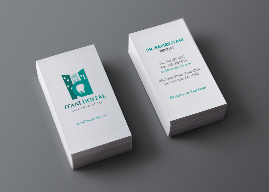
I wasn’t too crazy about this logo when I first designed it. Maybe it was the tooth my client requested for in place of the counter of the letter “D”. Dentist – tooth – dentist – tooth… too much of a cliche perhaps.
But after revisiting my work archive a few years later, I stumbled across this logo and thought – hey… it’s not too bad afterall. Surprising.
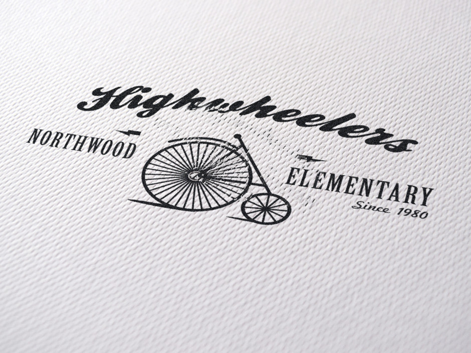
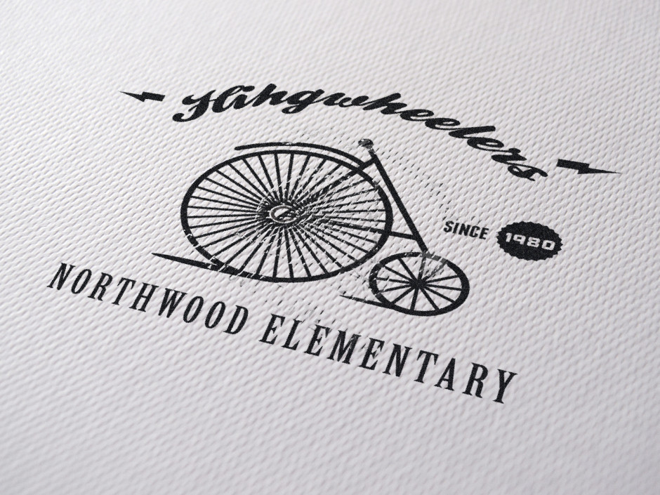
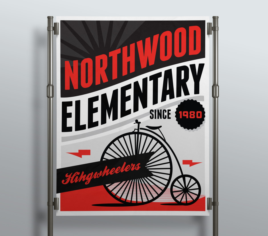
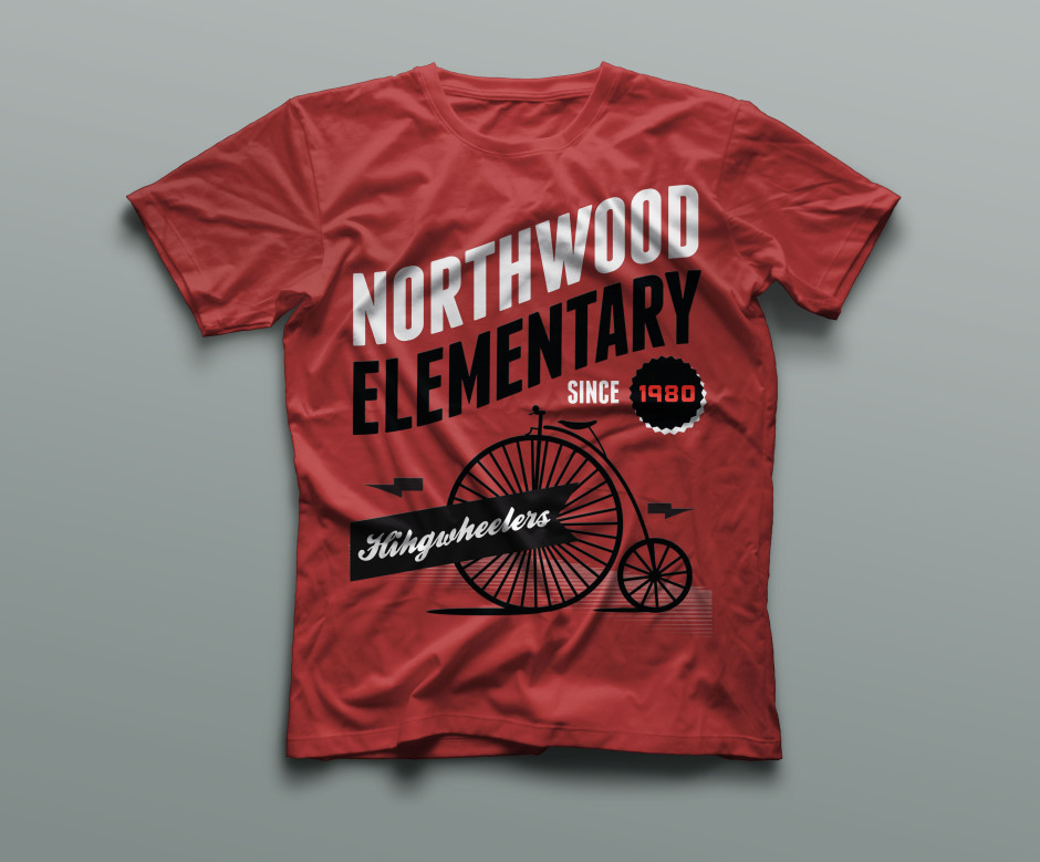
I notice that most of my favorite work come from my probono or barter projects. This was designed for my niece and nephew’s elementary school apparel.
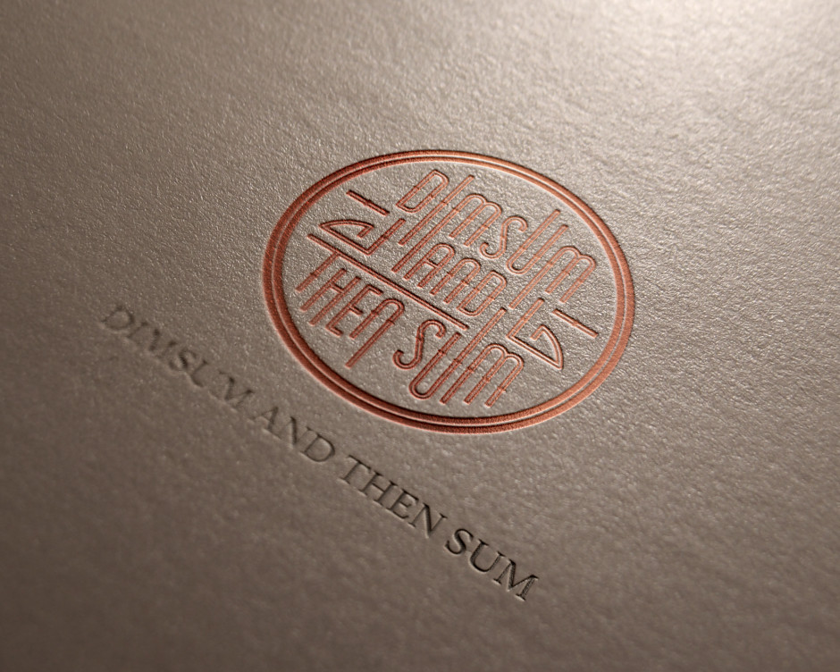
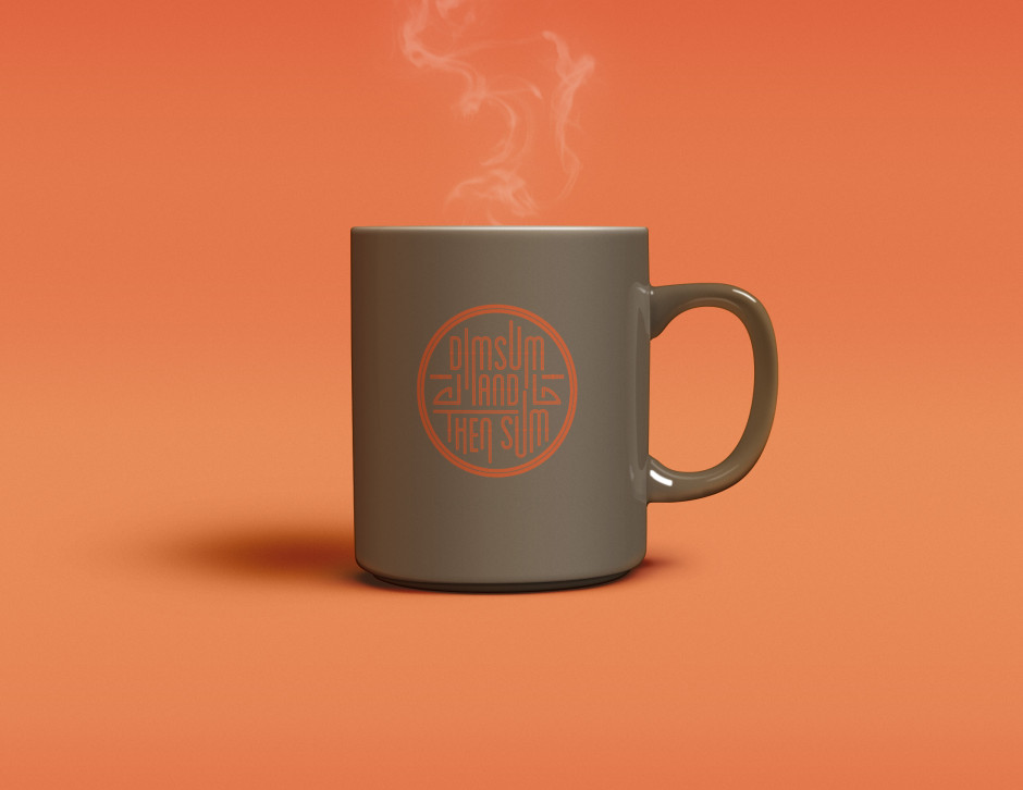
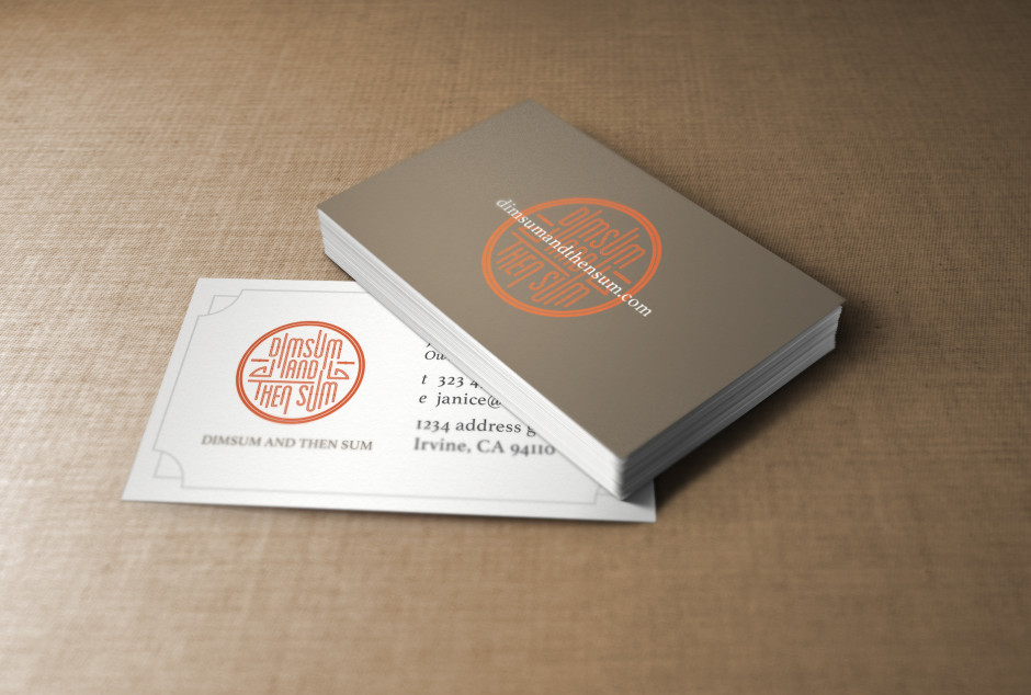
This has got to be one of my favorites from 2014. Most people would mistake it for a dimsum restaurant but it isn’t. It’s designed for a lifestyle blog that features the latest trends, food, fashion and gadgets.