• Home
  • Work
  • Hobbies
  • Essentials
  • Contact me
  • Photography Client Portal

And this is 40

It grew on me

January 15, 2015

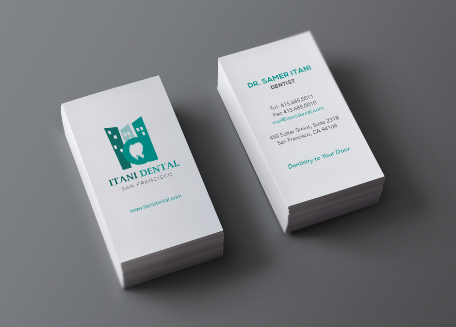
I wasn’t too crazy about this logo when I first designed it. Maybe it was the tooth my client requested for in place of the counter of the letter “D”. Dentist – tooth – dentist – tooth… too much of a cliche perhaps.

But after revisiting my work archive a few years later, I stumbled across this logo and thought – hey… it’s not too bad afterall. Surprising.


designlogo

You Might Also Like

GC Quality Restaurant Group Branding

September 24, 2018

Little Green Cyclo Vending Machine

June 14, 2017

Alon Photoshoot

April 3, 2017

No Comments

Leave a Reply Cancel Reply

Previous Post
2 Puffs Company Logos
Next Post
Is this going to make the cut?

© 2015 And this is 40. All Rights Reserved.

Back to top