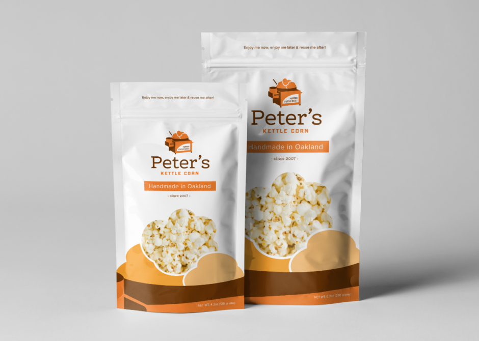
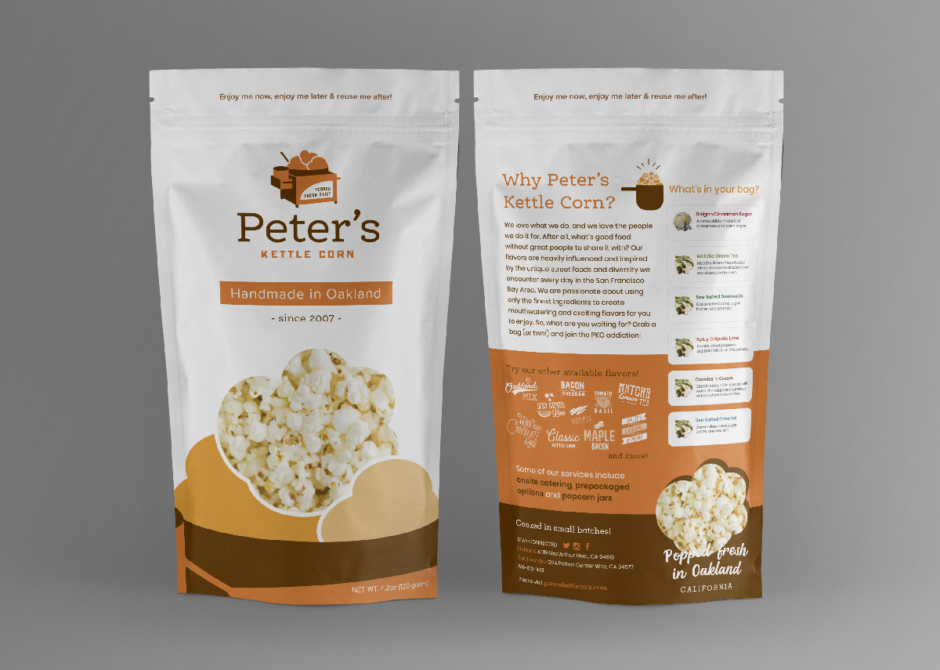
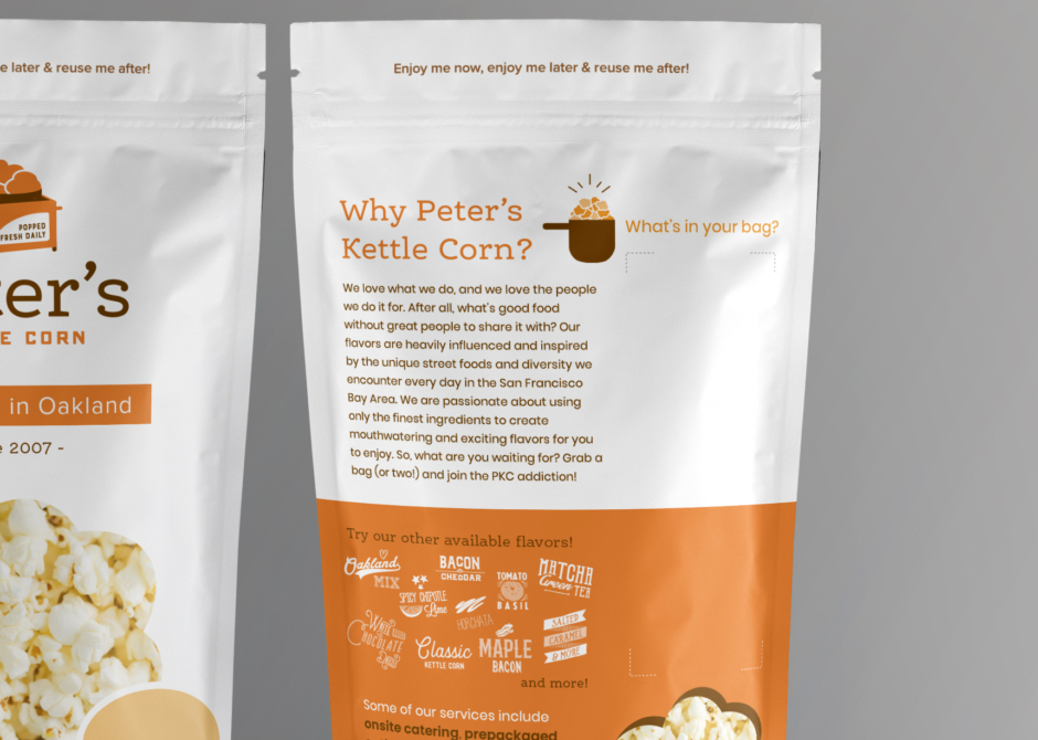
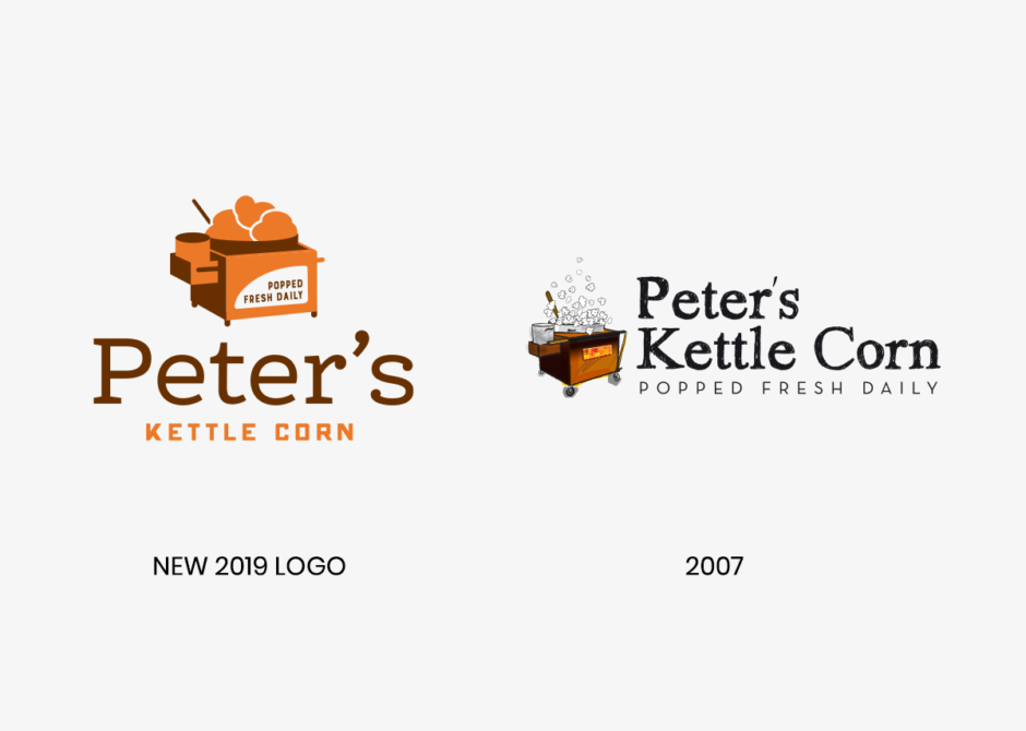
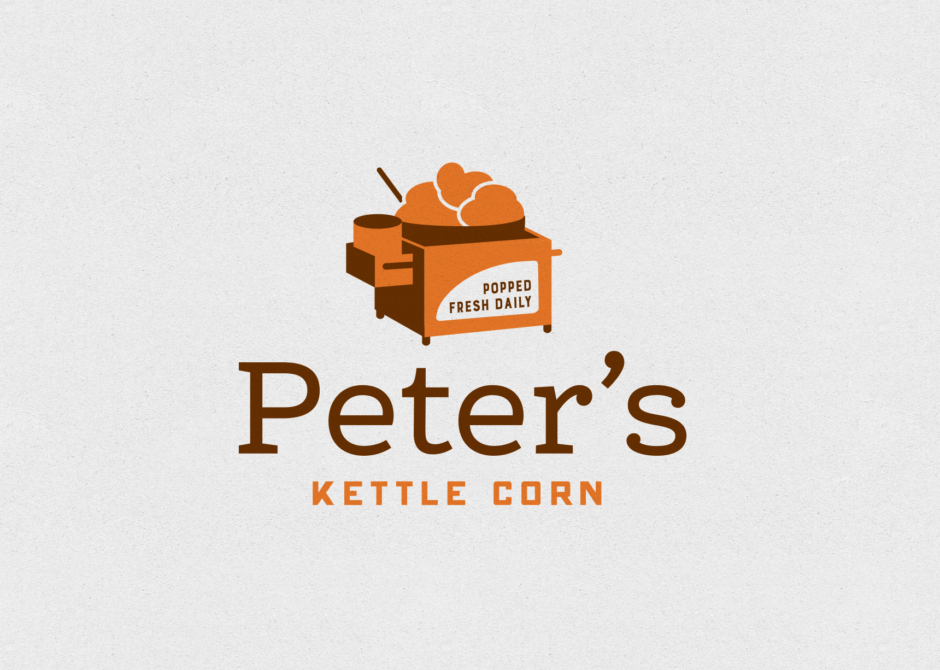
Presenting the latest designs for Peter’s Kettle Corn. The original logo was created in 2007, with gradients and detailed illustrations which have since become outdated. Therefore, we opted for a flat and minimalist approach that appeals to a wider audience while maintaining brand recognition. The logo features two colors, burnt orange and warm brown, which complement all the flavors of PKC.
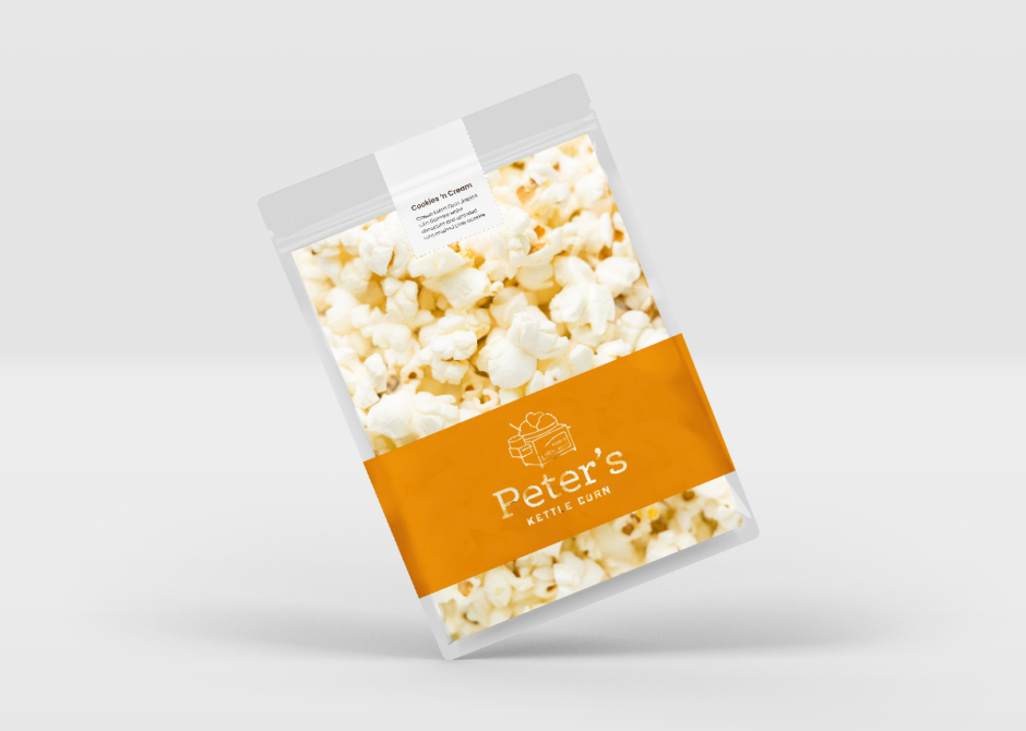
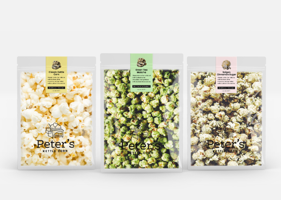
To accommodate PKC’s 30 different flavors, we had to devise a solution that would work for all without exceeding budget constraints. We decided to use 3×1 stickers, allowing space for up to (6) labels on the backside of the bag. This approach not only accommodated their customers’ preference for mixing up to 6 flavors per bag but also proved to be a design challenge that we successfully overcame.
With the design process now complete, we eagerly await the final product’s print. I’m confident that the outcome will be both functional and aesthetically pleasing, perfectly representing the PKC brand.